Del papel a la pantalla
Diez días para convertir un boceto a mano en la interfaz de RedCheck: qué sobrevivió de la libreta, qué cambió de sitio y los pequeños detalles que hacen que un planificador transmita calma.
By 20 March RedCheck had a complete API and no interface at all (part 2). On 21 March I created the React project. Ten days later the dashboard had a calendar, a heatmap, a focus mode and an AI button. This part is about those ten days.
A note on the screenshots: they aren’t from back then. To get them, I checked out the frontend exactly as it was on each date, ran it locally and fed it sample data. What you see is the real code of that day, with invented subjects and tasks.
Day three: the notebook on a screen
React, TypeScript, Vite and Tailwind CSS. Login on day one, registration on day two. On day three, 23 March, the first dashboard: a greeting, the date, and the tasks grouped by subject, each with a checkbox and its deadline.
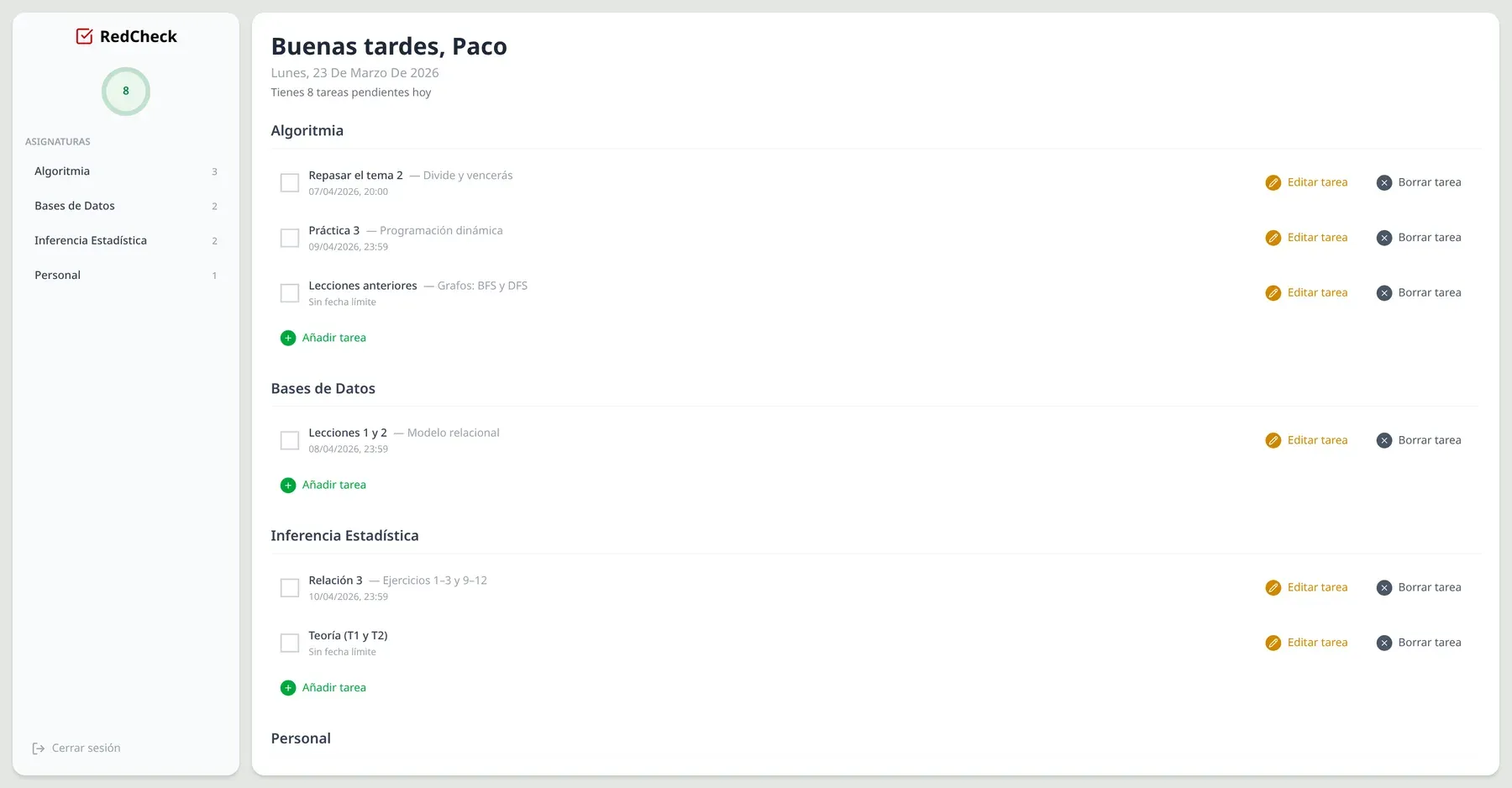
It’s plain, and it’s very close to the sketch from part 1, which was itself very close to my notebook. All the HTTP calls lived in a small API layer from the start, with an interceptor that attaches the JWT to every request. Since the backend already existed and was documented, the frontend never had to wait for an endpoint.
What moved, and why
Over the following week the layout changed more than I expected, and the sketch lost a few arguments with reality.
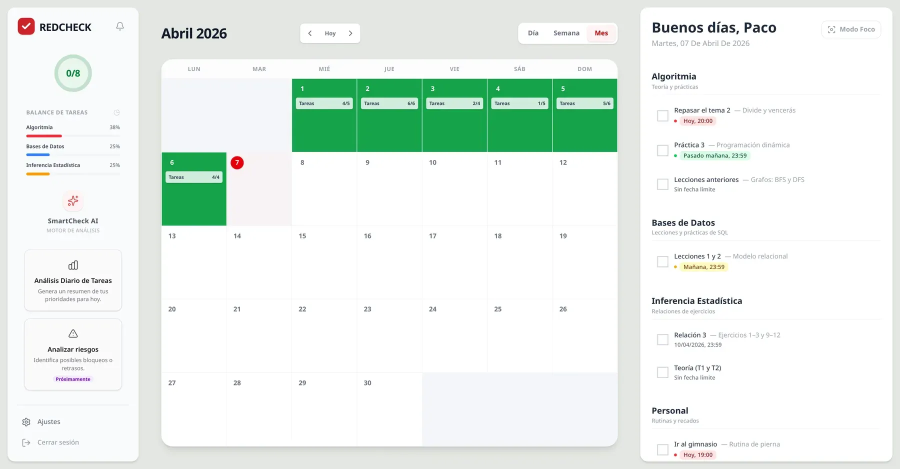
- The calendar moved to the centre. In the sketch it was a small month view tucked into the sidebar. Once each day showed how many tasks it held and how many were done, it was the most useful thing on the screen, and it deserved the space. The task list moved to a column on the right.
- The sidebar became a dashboard of its own. The progress circle stayed, and a “task balance” chart joined it: the three subjects with the most pending work, so you can see at a glance where to put the effort.
- Overdue tasks got their own block. In the notebook, an overdue task was simply copied to the next page, again and again. On screen, a task past its deadline moves to a separate “Out of time” section, still grouped by subject. It stays visible without polluting today’s plan.
- Dates became words. Instead of
07/04/2026, 20:00, a deadline reads “Today, 20:00” in red, “Tomorrow” in yellow or “The day after tomorrow” in green. Nobody should have to do date arithmetic to know what’s urgent.
A heatmap for consistency
The notebook could tell me how today was going. It couldn’t tell me how the last month had gone. That was the second thing I wanted from an app, and the reason the backend stores a progress snapshot for every day.
The interface turns each snapshot into a colour, inspired by GitHub’s contribution graph: a day with nothing planned stays blank, a day where nothing got done gets a faint red, and from there it goes through three greens as the completion rate passes 50 % and 80 %. The month calendar uses the same scale, so a good week literally looks green.
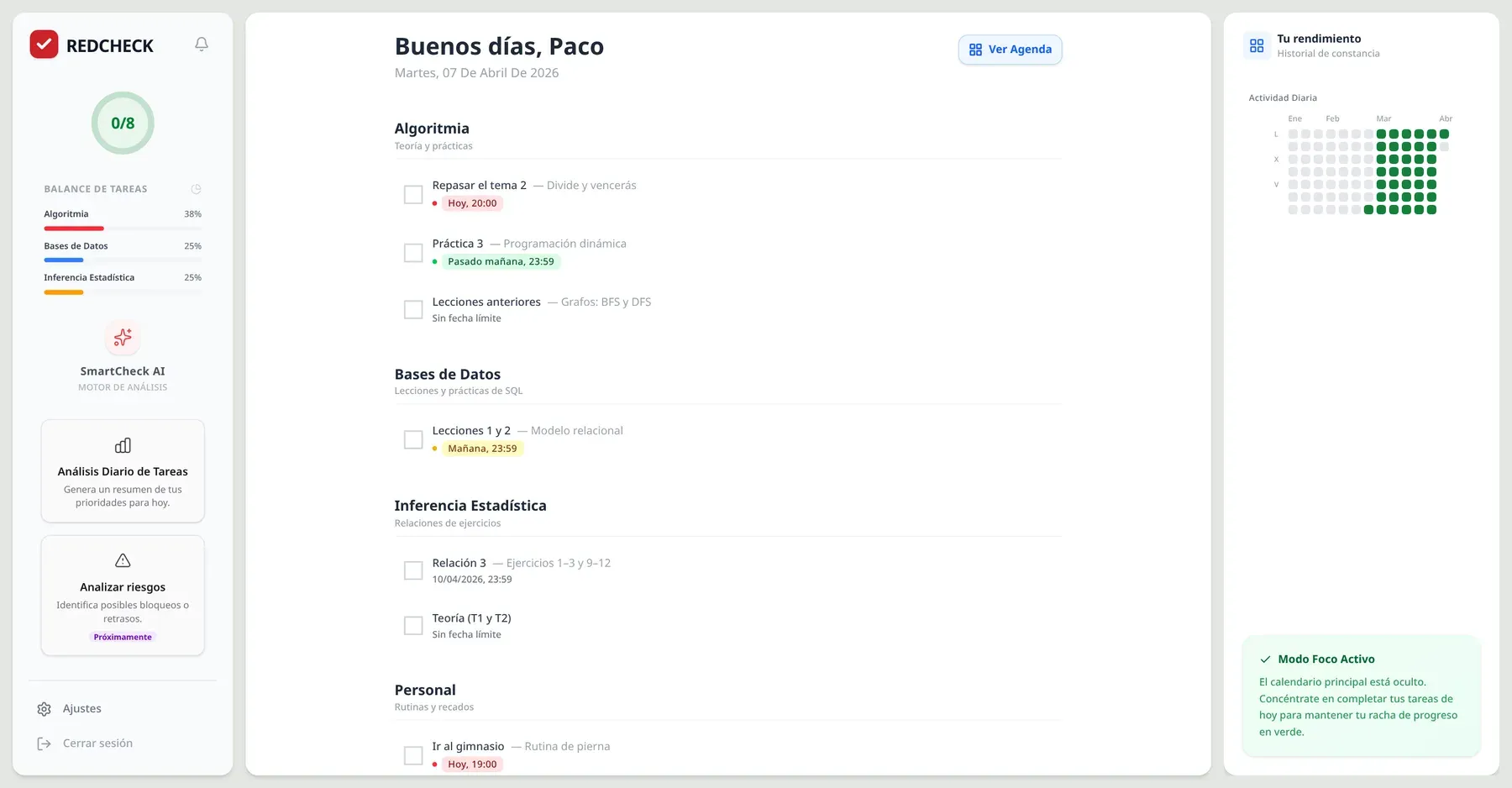
Focus Mode hides the calendar entirely and puts the heatmap next to today’s tasks: just the list and your track record, nothing else.
Small decisions
- No state library. React’s own hooks were enough:
useStatefor the interface, plain state for what came from the server, anduseMemofor derived data like today’s tasks or the heatmap, so they only recompute when their inputs change. Redux or Zustand would have been one more thing to learn and maintain for no visible benefit at this size. - Components split late. The dashboard started as one big file. On
day four it split into
Sidebar,SubjectSection,TaskItemandOverdueSection, once it was clear which pieces repeated. Splitting earlier would have meant guessing. - Motion, with a cost I didn’t see yet. On 27 March I added
framer-motionfor page transitions and small animations: a checkbox that pops, tasks that slide in and out. It made the app feel finished. It was also used in exactly one place, and its exit animations never actually ran. Removing it, months later, saved about 120 KB (part 15).
What I took from this stage
- A sketch is a hypothesis. The calendar moving to the centre wasn’t a failure of the sketch, it was the first thing I learned by using the real thing.
- Having the API finished first paid off exactly as planned: ten days of pure interface work, with no backend detours.
- The details that make an app calm are cheap: words instead of dates, overdue tasks set aside instead of piled on top.
In the middle of those ten days, on 26 March, a new button appeared in the sidebar: Daily task analysis. That’s the next part.
El 20 de marzo RedCheck tenía una API completa y ninguna interfaz (parte 2). El 21 de marzo creé el proyecto de React. Diez días después, el dashboard tenía calendario, mapa de calor, modo foco y un botón de IA. Esta parte va de esos diez días.
Una nota sobre las capturas: no son de entonces. Para conseguirlas, recuperé el frontend exactamente como estaba en cada fecha, lo arranqué en local y le di datos de ejemplo. Lo que ves es el código real de ese día, con asignaturas y tareas inventadas.
Día tres: la libreta en una pantalla
React, TypeScript, Vite y Tailwind CSS. El login el primer día, el registro el segundo. El tercero, 23 de marzo, el primer dashboard: un saludo, la fecha y las tareas agrupadas por asignatura, cada una con su casilla y su fecha límite.
Es sencillo, y se parece mucho al boceto de la parte 1, que a su vez se parecía mucho a mi libreta. Todas las llamadas HTTP vivían desde el principio en una pequeña capa de API, con un interceptor que añade el JWT a cada petición. Como el backend ya existía y estaba documentado, el frontend nunca tuvo que esperar a ningún endpoint.
Qué cambió de sitio, y por qué
Durante la semana siguiente el diseño cambió más de lo que esperaba, y el boceto perdió alguna discusión con la realidad.
- El calendario pasó al centro. En el boceto era un pequeño mes metido en la barra lateral. En cuanto cada día mostró cuántas tareas tenía y cuántas estaban hechas, se convirtió en lo más útil de la pantalla, y se merecía el espacio. La lista de tareas pasó a una columna a la derecha.
- La barra lateral se volvió un panel propio. El círculo de progreso se quedó, y se le unió un gráfico de “balance de tareas”: las tres asignaturas con más trabajo pendiente, para ver de un vistazo dónde poner el esfuerzo.
- Las tareas atrasadas tuvieron su propio bloque. En la libreta, una tarea atrasada simplemente se copiaba a la página siguiente, una y otra vez. En pantalla, una tarea que pasa su fecha límite va a una sección aparte, “Fuera de plazo”, agrupada también por asignatura. Sigue a la vista sin ensuciar el plan del día.
- Las fechas se volvieron palabras. En lugar de
07/04/2026, 20:00, una fecha límite dice “Hoy, 20:00” en rojo, “Mañana” en amarillo o “Pasado mañana” en verde. Nadie debería tener que hacer cuentas con fechas para saber qué es urgente.
Un mapa de calor para la constancia
La libreta me decía cómo iba el día. No me decía cómo había ido el último mes. Eso era lo segundo que quería de una app, y el motivo por el que el backend guarda una foto del progreso de cada día.
La interfaz convierte cada foto en un color, inspirado en el gráfico de contribuciones de GitHub: un día sin nada planificado queda en blanco, un día en el que no se hizo nada recibe un rojo muy suave, y a partir de ahí pasa por tres verdes a medida que el porcentaje completado supera el 50 % y el 80 %. El calendario mensual usa la misma escala, así que una buena semana se ve, literalmente, verde.
El modo foco oculta el calendario por completo y pone el mapa de calor junto a las tareas de hoy: solo la lista y tu historial, nada más.
Pequeñas decisiones
- Sin librería de estado. Los hooks de React bastaban:
useStatepara la interfaz, estado normal para lo que venía del servidor yuseMemopara los datos derivados, como las tareas de hoy o el mapa de calor, para que solo se recalculen cuando cambian sus entradas. Redux o Zustand habrían sido una cosa más que aprender y mantener sin ningún beneficio visible a este tamaño. - Componentes divididos tarde. El dashboard empezó como un único
archivo grande. El cuarto día se dividió en
Sidebar,SubjectSection,TaskItemyOverdueSection, cuando ya estaba claro qué piezas se repetían. Dividirlo antes habría sido adivinar. - Animaciones, con un coste que aún no veía. El 27 de marzo añadí
framer-motionpara las transiciones entre páginas y pequeñas animaciones: una casilla que hace pop, tareas que entran y salen deslizándose. Hizo que la app pareciera terminada. También se usaba en un único sitio, y sus animaciones de salida nunca llegaron a ejecutarse. Quitarla, meses después, ahorró unos 120 KB (parte 15).
Con qué me quedo de esta etapa
- Un boceto es una hipótesis. Que el calendario pasara al centro no fue un fallo del boceto, fue lo primero que aprendí usando la cosa real.
- Tener la API terminada antes salió exactamente como esperaba: diez días de trabajo solo de interfaz, sin desvíos al backend.
- Los detalles que hacen que una app transmita calma son baratos: palabras en lugar de fechas, tareas atrasadas apartadas en lugar de amontonadas encima.
En mitad de esos diez días, el 26 de marzo, apareció un botón nuevo en la barra lateral: Análisis diario de tareas. Esa es la siguiente parte.
- Frontend